The Latest Color Trends Recommended by Professional House Painters

Introduction
Color trends now reflect how people live, host, rest, and work at home. Professional painters report a clear shift away from harsh contrast and short-lived novelty. Current palettes feel warmer, softer, and easier to maintain over time. Across new builds and older properties, experts are recommending shades that support natural light, hide wear, and create a calm backdrop for furniture, flooring, and everyday family routines.
Warm Neutrals
Professional painters are seeing stronger demand for warm neutrals than cool greys. Soft beige, oat, clay, and almond create steadier light through the day. These shades also soften sharp lines in open-plan homes. In suburbs with mixed housing stock, including clients seeking advice from House Painters in Manukau, painters often recommend warm neutrals because they pair well with timber, stone, and matte black fixtures.
Greige Still Holds Value
Greige remains popular because it balances warmth with a clean, modern finish. Skilled painters use it in hallways, living rooms, and resale-focused renovations. It sits comfortably beside white trim without looking stark. Many professionals suggest mid-tone greige for busy family zones because marks show less quickly, which helps walls stay presentable between larger repainting cycles.
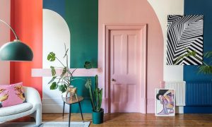
Earthy Greens
Muted green continues to rise, especially in bedrooms, studies, and dining areas. Olive, sage, and eucalyptus feel grounded without making spaces too dark. Painters often pair these hues with off-white ceilings and lighter joinery. That contrast keeps rooms fresh while still adding character. Green also links indoor spaces with gardens, which suits homes that open onto decks or planted courtyards.
Blue With Restraint
Deep navy is no longer the only safe blue choice. Painters are recommending dustier tones, such as storm blue, slate, and mineral. These colors bring depth while staying easier to live with every day. They work well on feature walls, cabinetry, and exterior doors. Used in measured amounts, blue adds structure without overpowering surrounding finishes or soft furnishings.
The Appeal of Soft Whites
Soft whites remain essential, though the preference has shifted from icy formulas to creamier options. House painters often choose whites with subtle yellow, sand, or linen undertones. These tones reduce glare and help natural materials look richer. They are also practical for ceilings and trims, where a gentler white can connect separate rooms and support a more cohesive interior scheme.
Terracotta and Clay Accents
Terracotta and clay are showing up in smaller areas rather than full-room treatments. Painters see them used on powder rooms, entry walls, and sheltered outdoor zones. These tones add warmth quickly and suit homes needing more personality. Used carefully, they complement concrete, timber, and brushed metal. Their strongest value lies in creating interest without forcing major changes to larger neutral surfaces.
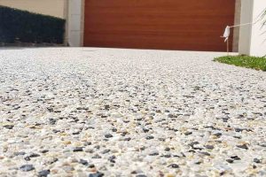
Exterior Colors Are Getting Softer
Outside, strong charcoal still appears, yet many painters now guide clients toward softer exteriors. Mushroom, taupe, warm stone, and muted olive are gaining ground. These colors sit better in changing daylight and tend to age more gracefully. Professionals also note that gentler exterior shades can make roofs, fences, and garage doors feel more integrated, which improves overall street appeal.
Finish Matters Too
Color choice alone does not decide the final effect. Painters stress that sheen level changes how a shade reads on the wall. Low-sheen finishes often make modern colors look calmer and more expensive. Semi-gloss still suits trims, doors, and wet areas, though overuse can create glare. A well-matched finish helps the selected tone stay consistent across morning sun, evening shadow, and artificial light.
Testing Beats Guesswork
Professional painters rarely recommend choosing from a tiny swatch alone. Large sample patches reveal undertones that can disappear on printed cards. Light direction, flooring color, and window size all affect the result. Many experts suggest testing two or three options on different walls before approval. That simple step reduces costly repaints and helps households feel confident before the full job begins.
Trends With Staying Power
Painters generally steer clients away from extreme shades that date quickly. Current recommendations favor colors that feel current, yet still easy to live with after several years. Warm neutrals, muted greens, soft whites, and dusty blues fit that standard well. They offer personality without becoming tiring. For most homes, the strongest trend is not drama, but balance, comfort, and visual longevity.
Conclusion
The latest color advice from professional house painters points to practical beauty over short-term fashion. Homes are moving toward grounded neutrals, softer exteriors, and selective color accents that support daily life. These trends work because they respond to light, materials, and maintenance needs, not passing hype. For property owners planning a repaint, the smartest choices are usually shades that feel calm, flexible, and dependable across every season.